Brand + Website Launch for Desi Creswell
I’m so excited to share with you a behind the scenes peek of the brand and website development for Desi Creswell. Desi is a Certified Life and Business Coach who helps interior designers stop feeling overwhelmed so they can intentionally build profitable, fulfilling businesses that enrich and support their lives as a whole.
While she already had an established online presence she wanted something that could more accurately reflect her growth, maturity, personality, and the calm, steady energy she brings to her clients. I’m delighted to report we achieved just that - but let’s take a look at how we got there.
Desi initially reached out wanting a website, but as the process unfolded we realized that a brand overhaul was needed if she wanted her aesthetic to better reflect her business now.
So we began with strategy by identifying her core values, understanding her ideal client, and learning what was important to her when it comes to design. For Desi, having a professional yet approachable online presence was very important. Especially since Desi works with interior designers, the visuals needed to be more polished and beautiful.
Some of the words Desi used to describe her ideal branding were:
Polished and professional but also approachable
Expert
Friendly
Simple
Classic/timeless but fresh
Open - welcoming you in - it's a safe place.
A little bit of fun - as in I take our work together seriously but we don't always have to take ourselves so seriously.
I love when clients come and want a variety of things in their visual brand, such as fun but expert, and polished but casual - because you CAN achieve both!
We delivered on those adjectives with an elevated and calming visual direction. And Desi agreed by saying “The updated look is polished, professional and still approachable. Exactly how I want my clients to view my brand. It also conveys my calm, steady energy. This is something that clients consistently comment on as a reason they love to work with me.”
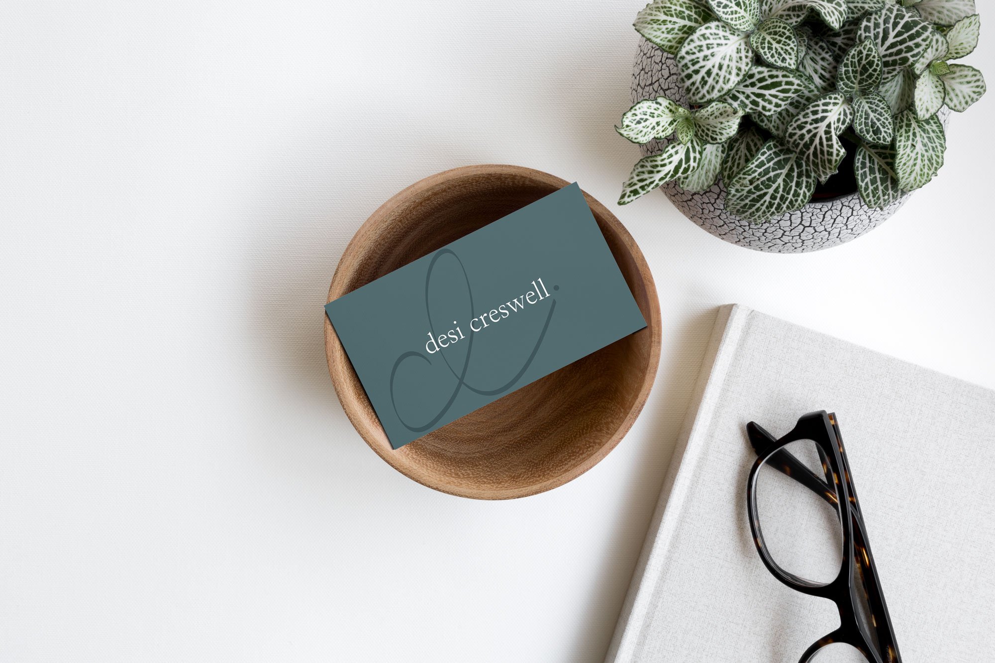
The colors are a mix of inviting, friendly, and trustworthy, and grounded. The perfect combination for this business.
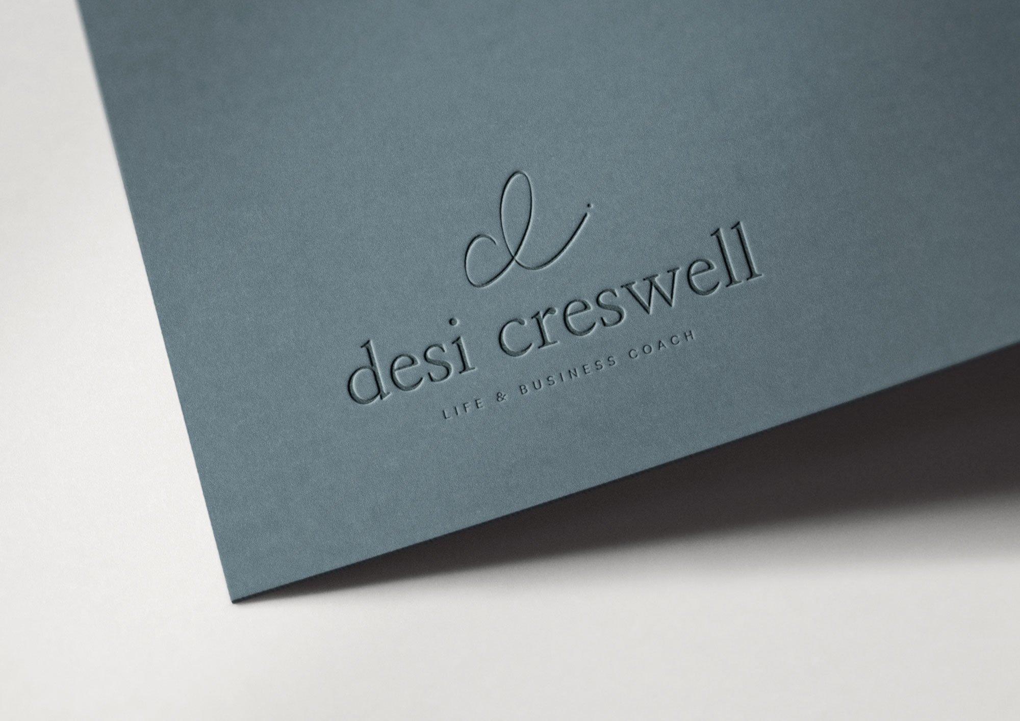
For the logo, we wanted to keep it clean, simple, and minimal. Desi wanted an emblem of 3 letters combined: “c” “d” and “i” standing for Desi Creswell Interiors. And I did that with a cursive, handwritten design that immediately appears to be a “d” but you can also see the “c” and “i” if you look carefully. We both loved how it turned out!
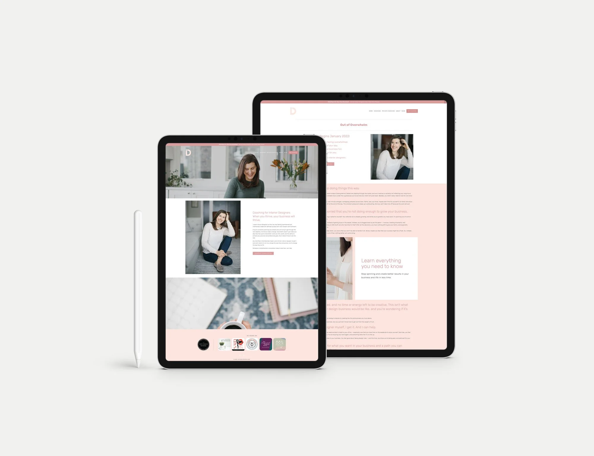
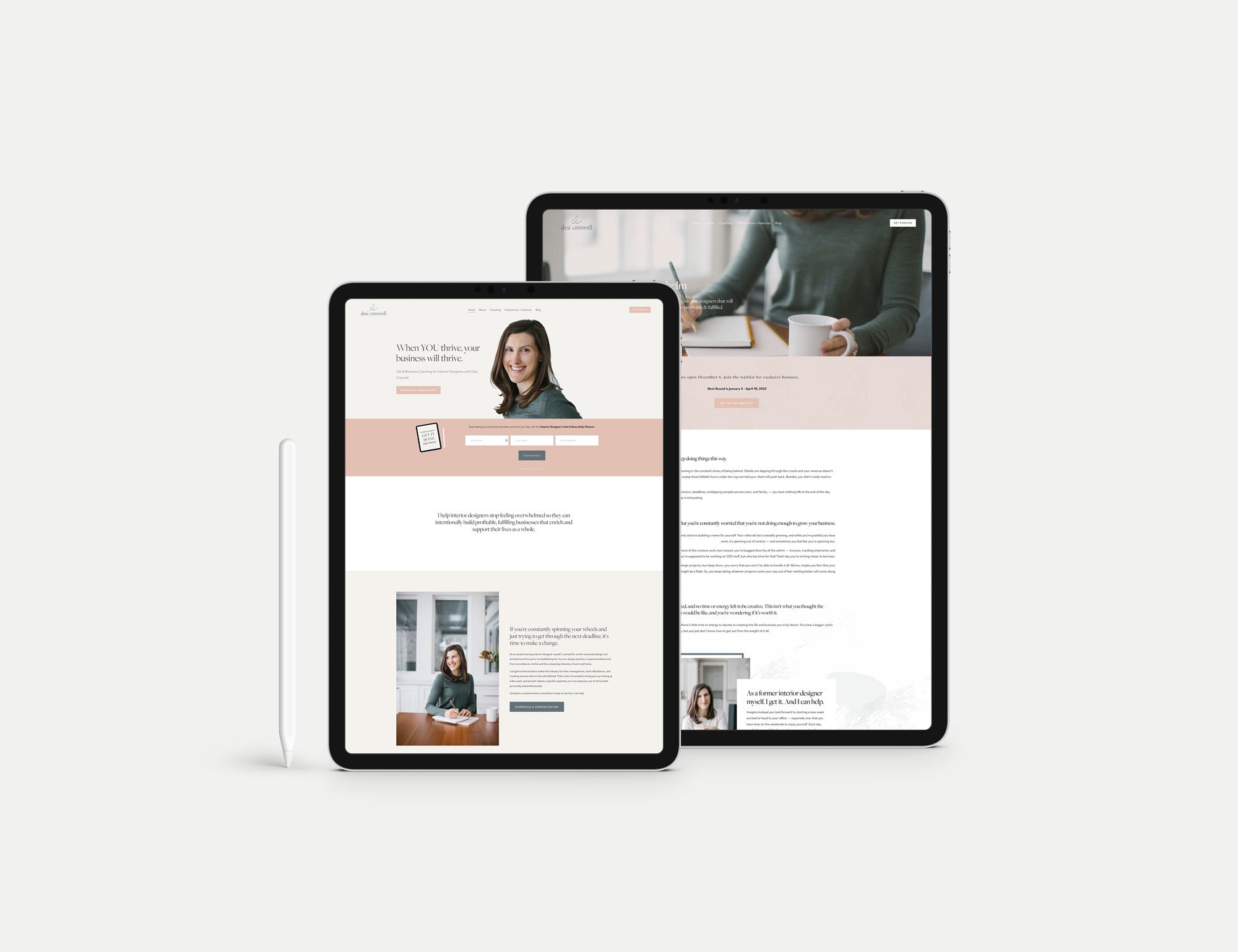
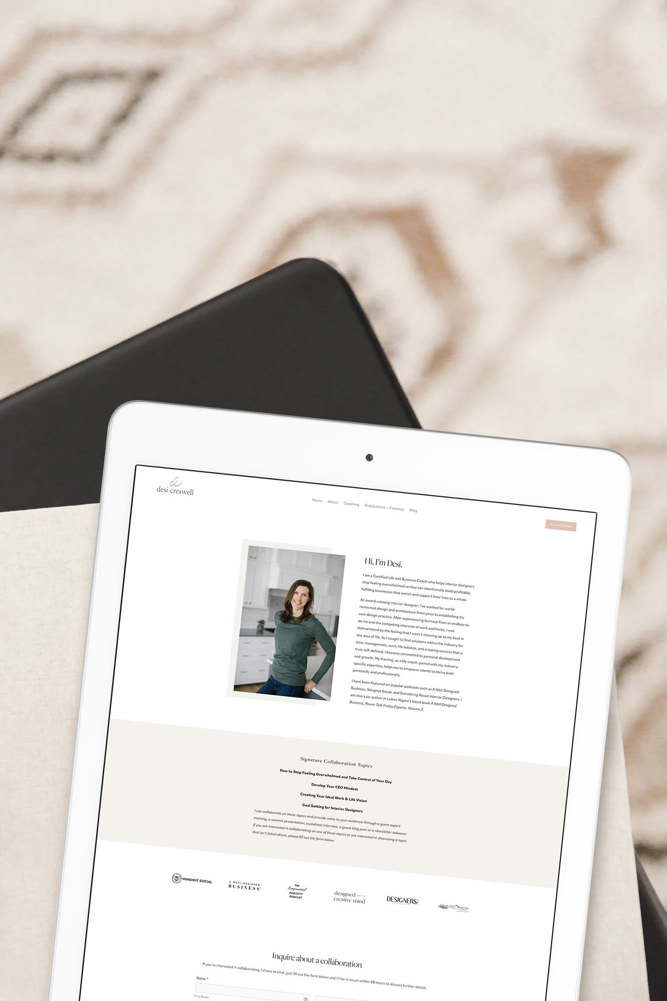
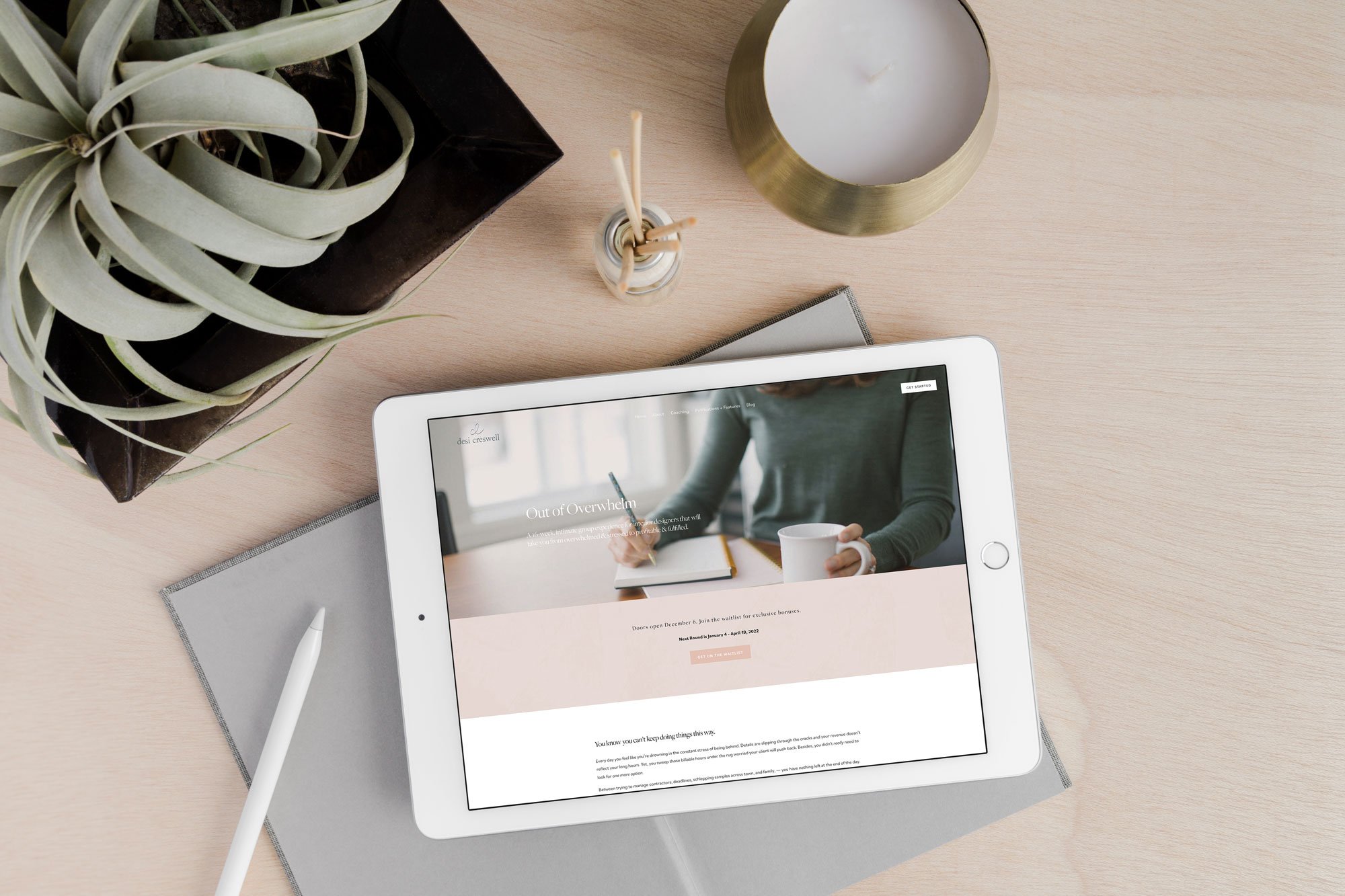
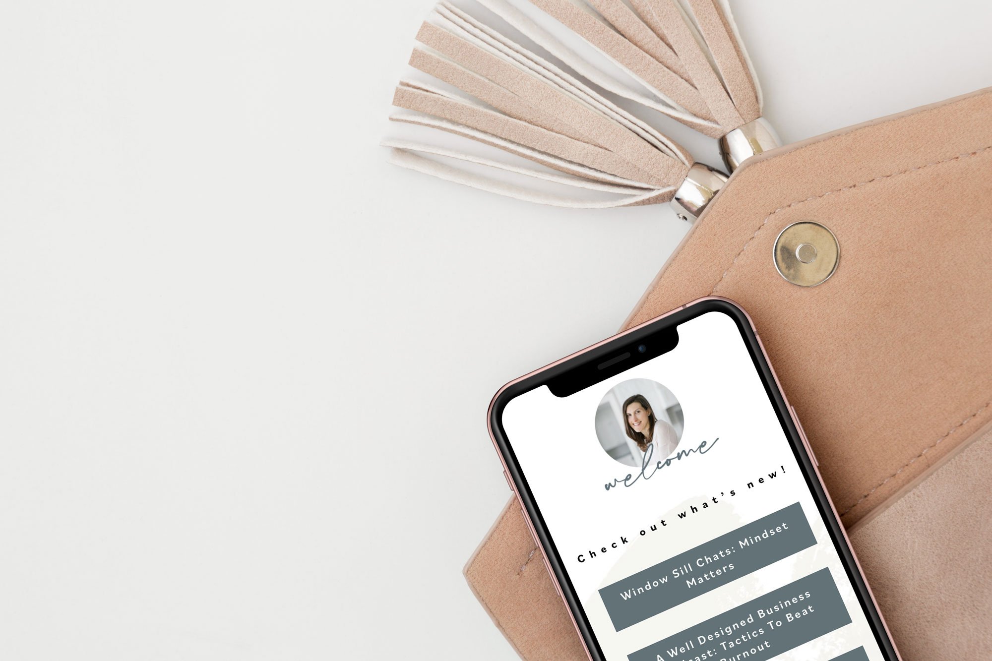
Here’s a look at the Brand Style Guide, marketing materials, and new site:

At the end of the process I asked if we accomplished her design goals and what was her favorite part of working together and here’s what she said:
“We did! I appreciated that you were prompts with timelines and organized in your process. That's not always typical of creatives :) My favorite part is that my new branding really reflects my personally and presence as a coach.”
Here’s a look at where we started, and where we landed. I always love a good before and after!
Desi’s visual brand and website now accurately reflects and quality and experience that Desi brings to the table and helps her clients feel like they are taken care of when they choose to work with her.
AND, an amazing result of not only the new branding and easy-to-navigate website, but also Desi as a fabulous coach, is that she sold out of her group program the day she opened the doors! Results like these make me so incredibly happy for my clients because their biggest business goals are possible when they choose to invest in themselves and their business.
Here’s what Desi said about the process of working together:
"I am thrilled with the results of my stunning new website! -- I launched my group program right after the site launched and easily sold the 16 spots on the website, opened a second group and sold an additional 11 spots! I wanted the website to highlight the specific structure of the program and lay out the details so it would be easy for potential clients to scan the page and find the info they were looking for. RuthAnn designed a clean and easy to navigate site that allowed people to see what it would be like to work together with special touches (like custom icons) that made the site engaging so potential clients could see themselves getting the same results. I highly recommend RuthAnn and her high-converting design work!"
To view the new site, learn all about Desi, and to get on the waitlist for her next group program, head over here.

