Brand + Website Reveal for She’s Health Conscious
I am so excited to share with you the brand and website reveal for She’s Health Conscious and a little behind the scenes of how we came up with the design, my collaboration in working with Gabby to get EXACTLY the look she was going for, and how she felt in the design process - so let’s dive in!
Gabby Hardesty was referred by a former client and I was really excited to work together. Gabby’s energy is infectious and her love for holistic health really comes through. I knew our partnership would be a good one and I was so excited when she said in the discovery call “A lot of health and wellness go earthy vibe and I want mine to be cool, sexy, and trendy.”
While I often times steer away from trends, I wanted to deliver a visual brand that was youthful, feminine and fun. Working with Gabby was a true collaboration to delivering the right vibe and tone for her visuals and I loved helping her vision come to life.
A huge compliment she said of our work together was “She allowed me to have my voice” And I love that because I really believe in collaboration and want my clients to feel heard, seen, and a part of the process.
Some of the words that set the brand tone were: Sexy, Chic, CHEEKY!, Fun, Vibrant, Hip/Trendy - pushing the envelope at times - Makes health COOL.
Here are some of the logo sketches that helped get us to the final result:
In the logo design process, we went through several revisions to get to where we wanted - and I’m glad we made the extra effort because the end result was PERFECTION. Here’s what Gabby said about the logo:
“The logo icon is something I had no idea what I wanted but I knew I wanted to LOVE it and for it to represent me and my brand is a simple elegant way. somehow RuthAnn and I were able to create that with just a few revisions.”
Here is the full logo suite along with the Inspiration Board and Color Palette - truly the most fun and feminine color palette ever!
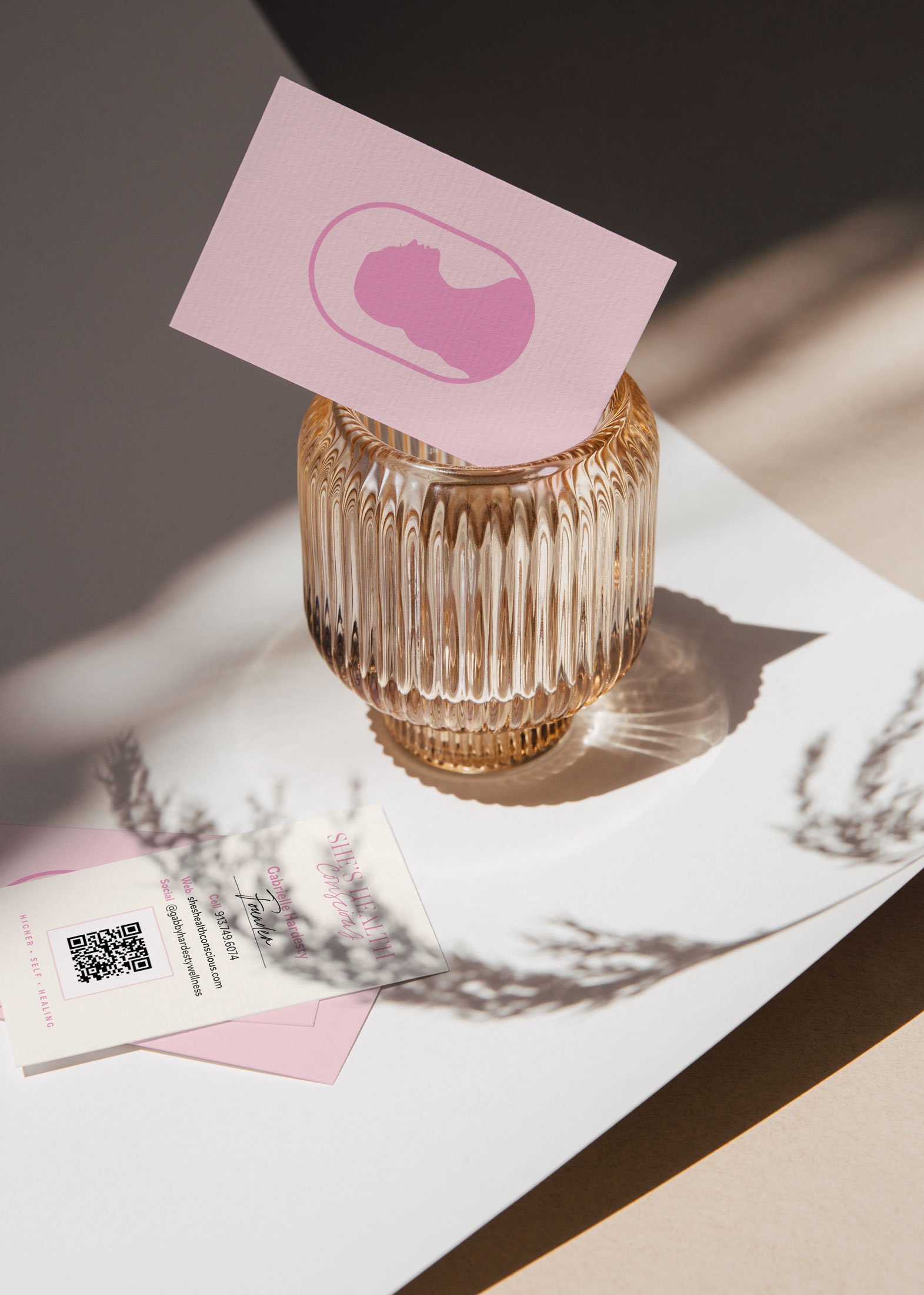
After the branding was complete along with collateral items of business cards and a Health History Form design we moved on to a custom website designed in Squarespace. She confessed:
“Sitting down and designing a website is something I probably would've kept pushing off because I felt overwhelmed by the amount ideas and goals I had surrounding my business branding and website features.”
Overwhelm is the number one thing I hear from people when they think of creating (or rebranding) their website. And a lack of time is number two:
“I also didn't have the time or energy leftover to learn how to put a well designed website together, especially if I wanted all the features and "wow" factors - that was going to add even more stress to my plate because I tend to be a bit of a perfectionist.”
My clients believe a great customer experience begins with a great website experience and Gabby felt that way too. Which is why I was so happy to help deliver what she wanted in this process.
I know how daunting a new project like an entire brand and website design can feel, but I’m here for you all the way. I walk all my clients through a proven system, that allows us to tackle one aspect of the project at a time so the project is manageable and actually enjoyable. No overwhelming projects here!
Here’s a look at her new site:
At the end of the process I asked if we accomplished her design goals and what was her favorite part of working together and here’s what she said:
“RuthAnn helped streamline my ideas by giving me actionable steps at each phase. I'm glad I took the leap of faith and invested with RuthAnn, I'm not sure my business would be this far along today if I wouldn't have. I feel good knowing I have her support and involvement moving forward as my business grows and evolves.”
I’m so proud of Gabby and the exciting future for She’s Health Conscious!
Check out the new site and give Gabby a follow on Instagram.


