Showit-Like Changes to Squarespace Are Here - The Brand New Fluid Engine Editor
Guys. I’ve been with Squarespace for a long time (6 years to be exact) and I’ve just accepted the fact that there are a lot of limitations when it comes to the website editor and getting a certain look you want. And I’ve learned a lot of codes and workarounds to GET the look I want.
But not anymore, cause Squarespace just rolled out a whole new editor (only available in Squarespace 7.1) and it’s FANTASTIC. In this post I’m gonna breakdown the 5 biggest changes and how this affects sites moving forward. Let’s dive in!
To start with, the Classic Editor of Squarespace - that we know in 7.0 and 7.1 sites has been around since 2012 and has worked really well for the last decade. But just today, Squarespace has released their new Fluid Engine Editor which is far and away the biggest innovation to Squarespace since its inception.
Fluid Engine is an advanced editor that allows you to move blocks at will anywhere on the canvas. If you know of Squarespace and how it used to be that just wasn’t possible. We needed spacers to move any block around. With Fluid Engine you’re also able to layer images, resize images within the editor, and place images up the edge of a section, and make mobile-isolated design changes. So let’s dive into each one of these:
Place blocks anywhere on the Canvas
When you first get into the editing mode in Fluid Engine, you’ll notice that when you move items around on the canvas you see a grid appear in the background. This allows you to move and space things around with a guide. This grid disappears as soon as you’re done moving an image around. You’re able to change the grid to have padding or to have no padding which just allows for more control.
This is such a huge relief to us designers who have been wanting to get really creative with our sites but it just wasn’t possible before in the Classic Editor. Placing images on a site required a lot of finagling and some special tricks (or code) to make this possible. With Fluid Engine, your canvas becomes a grid and you’re able to place images or text anywhere on the grid. You’re able to add space to the grid or you could have no space between your lines meaning there won’t be any space between your content.
I recommend using the ‘no space grid’ option because then you won’t have to deal with padding around your blocks.
2. Layer images
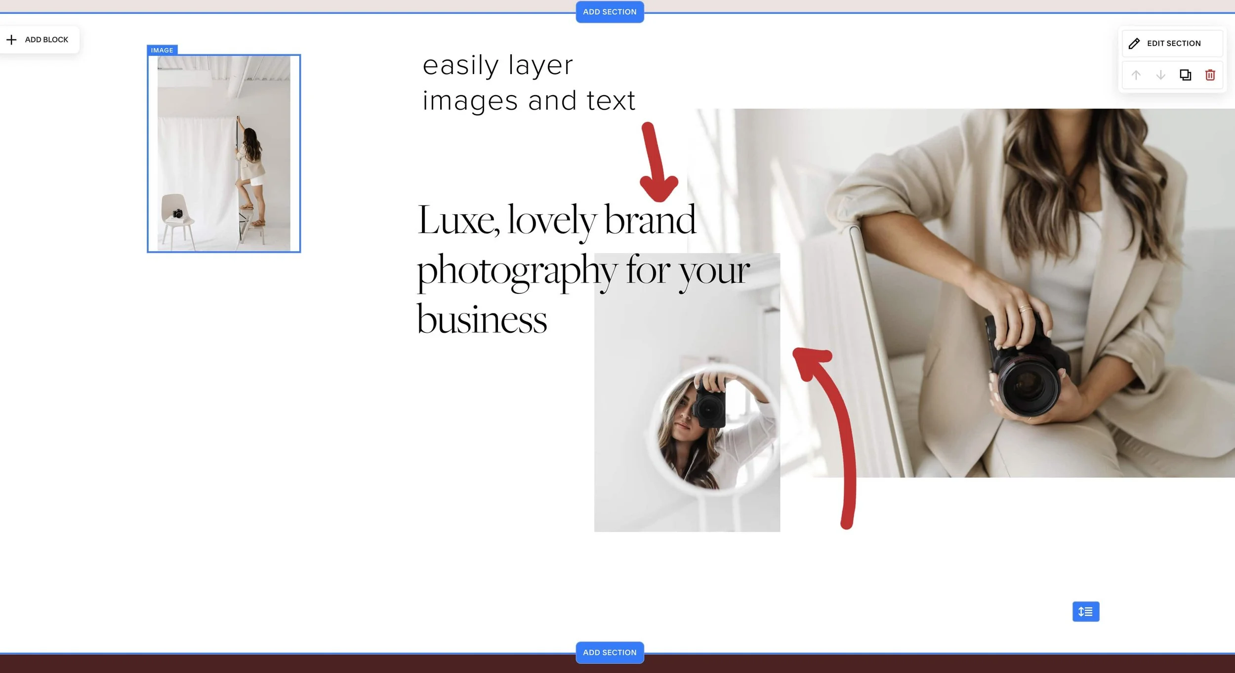
Before there was no such thing as layering images so you had to placed already layered images (done in Canva or Photoshop) to the page. Now, you can easily place image or text over one another and when you place one over the other, the image block option appears where you can choose to “bring to front” or “send to back.” This is SUCH a huge improvement and as a designer I cannot wait to implement some beautiful designs for my clients with this feature.
3. Resize Images
Resizing images by clicking the corner and dragging out has become standard in Canva, social media, and other places, so Squarespace took a cue and added it into their Fluid Engine Editor and I’m so glad they did. I remember loving this featured when I used to design in Showit and was always frustrated that I had to get my image size just right before placing it in, or resizing an image with a spacer. Now, in Fluid Engine, all you need to do is click a corner and drag out to fill up the photo in the frame, or you can click the content editor and choose “frame-fill” to make sure the image fills the frame. This is such a welcome addition and makes Squarespace feel a lot more like Showit than Squarespace.
4. Full-width content
This feature is one of those things that I was DYING for when I was designing client sites. I would always want an image to go beyond the bounds of the content width but it was never possible, until now. Using Fluid Engine, if you wanted to take an image beyond the bounds of content, simply click and drag it to the edge and place it where you want. This makes design so much more engaging, dynamic, and exciting because of the creativity this opens up.
5. Mobile-only editing
Years ago when I designed on Showit I remember thinking I DID NOT like the mobile design feature. Because this meant you had to design the site on desktop THEN design the site again on Mobile. While it was frustrating then, NOW it seems like a necessity. Because in 2022 everyone uses their phones for everything. Most of my site traffic is done through mobile and it’s really important to have a great mobile experience in addition to a great desktop experience. Not only that, as my skillset has increased so has my demand for creativity and ability to make specific changes. Fluid Engine offers design isolated in mobile.
By clicking on the mobile icon in the top right, you’re able to enter the mobile view.
When you do, you’ll see that you have access to the Edit mode. Click on edit and you’re able to edit the content isolated from the desktop. Once you save your changes and go back to desktop mode, you’re able to see that the desktop version has not changed - only mobile.
This is such a fantastic and welcome change to Squarespace and while it will take more time for the designers on the site, it makes the user experience so much easier and better due to the fact that you can resize the content, change the order, and make tons of individual edits to the mobile experience.
The Fluid Engine Editor is a big change and I believe is primarily for designers who want more creative freedom and the ability to make their sites look how they want. For the layperson who just wants a great website and not worry about making individualized changes to mobile or layering images, you can still choose to design in the Classic Editor and nothing will change for you. I really like that they give people that option.
A few things to note:
• Everyone has access to Fluid Engine if you have a 7.1 Squarespace website. While this makes the editing process totally different and more creative, it doesn’t change the interface, or main characteristics of 7.1
• If you want to use Fluid Engine in your 7.1 site you’re able to by going into the edit mode and you have the option of staying in the Classic Editor or changing to Fluid Engine. I really like this because the Classic Editor is good if you want a standard page set up, but Fluid Engine is great for most other designs you’ll be doing.
• And if you want to continue using the Classic Editor, you can! You don’t have to switch over. When you create a new section, just scroll all the way down to where it says “Add Blank - Classic Editor.”
What I recommend to people who want to try it out, is create a not linked page and play around with it! That will help you get used to the new features without worrying that what you’re doing will affect your live site.
How this affects you whether you have a Squarespace site OR want one:
The upgrade to the Fluid Engine editor gives people the freedom and flexibility to create even more detailed, custom, and unique website designs. If you already have a Squarespace site but it’s NOT in 7.1, now would be a GREAT time to upgrade to unlock all the new features. If you have a site in 7.1 and want to give the new editor a try, play around with it one section at a time and get creative! And if you have been thinking about Squarespace but just haven’t made the move, NOW is the perfect time to go all in on Squarespace. Not only is Squarespace amazing when it comes to SEO, blogging, making quick changes and more (I go on in this post) but with these new options, you have more design and creative control than ever before. If you’re looking for a designer well-versed in Squarespace and want to chat about some options, schedule a free call with me here.
I would love to hear what you think about these changes.
Are you excited? Intimidated? Tell me all the things!


