Why You Should Be On Squarespace 7.1
Are you using the old version of Squarespace? If so, you’re missing out on some amazing features that can instantly elevate your design and style. From an expansive color palette to an entire font pack, Squarespace has made significant updates to its platform with the goal of creating a more user-friendly experience that delivers powerful results. Let’s dive into the biggest changes and why NOW is the best time to switch over.
If you didn’t know, there are 2 versions of Squarespace. The older version, called 7.0 and the new version called 7.1 which also houses Fluid Engine. Let me explain…
When Squarespace came out back in the day, the way you designed your site was within a template. So your whole site could be set up on that one template, such as Brine, or Bedford, or Pacific, etc. Similar to Wordpress and themes, you were kinda stuck.
Enter Squarespace 7.1 which came out in 2019 and the whole layout and design completely flipped on its head. Now, you can easily switch between templates because each page on your site could be a different template. You can mix and match and there are SO many more design capabilities. Fast forward to July of 2022 and things are EVEN BETTER with the release of Fluid Engine - Squarespace now has a true drag and drop editor that makes designing a dream.
So if you’re on Squarespace 7.1 you’re able to use the Classic Editor which is the old way of designing with the spacers, or you can easily upgrade each section of your site to Fluid Engine which unlocks all the incredible design features.
What does this all mean? If you’re on the old version of Squarespace, you’re missing out.
Here’s just a quick list of upgrades that Squarespace 7.1 has:
• Not confined to one template - all the template options for every page on your site
• True drag and drop editing features
• Mobile isolated design
• Better SEO
• Extensive font pack
• 10 Color Theme options to expand your branding
• A more simple Backend
• Image editing such as resizing within the design
• Photo Library
• Text design changes within the page design
• And so much more!
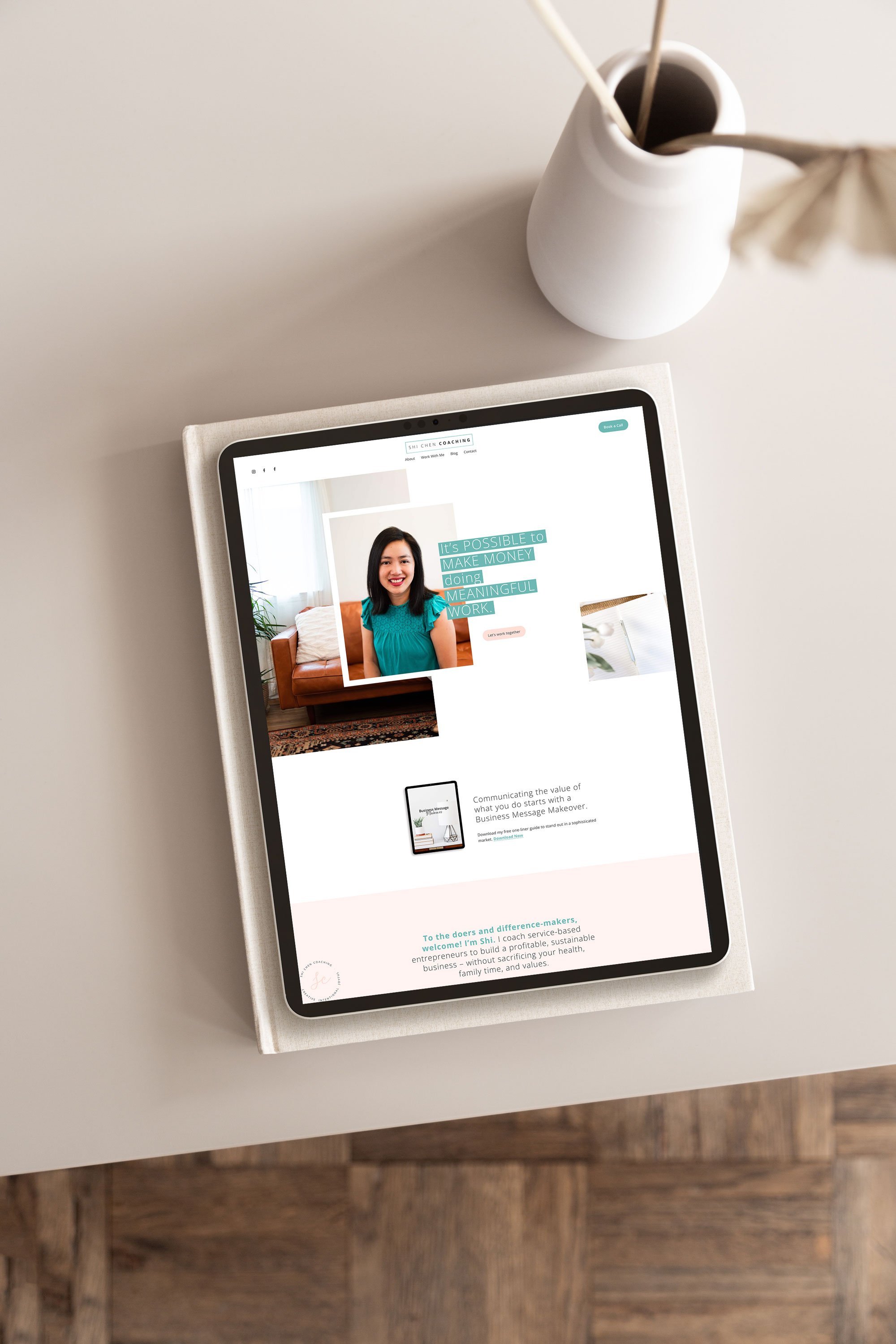
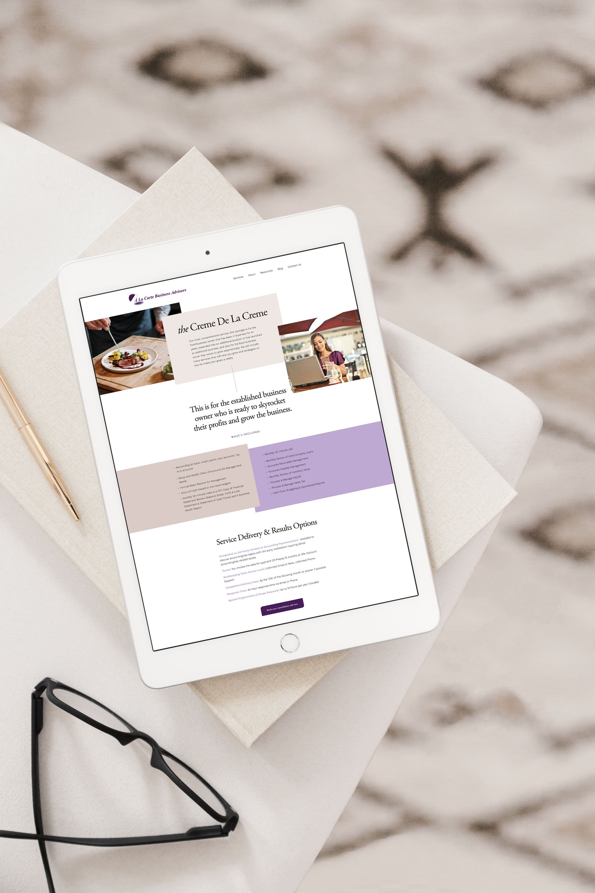
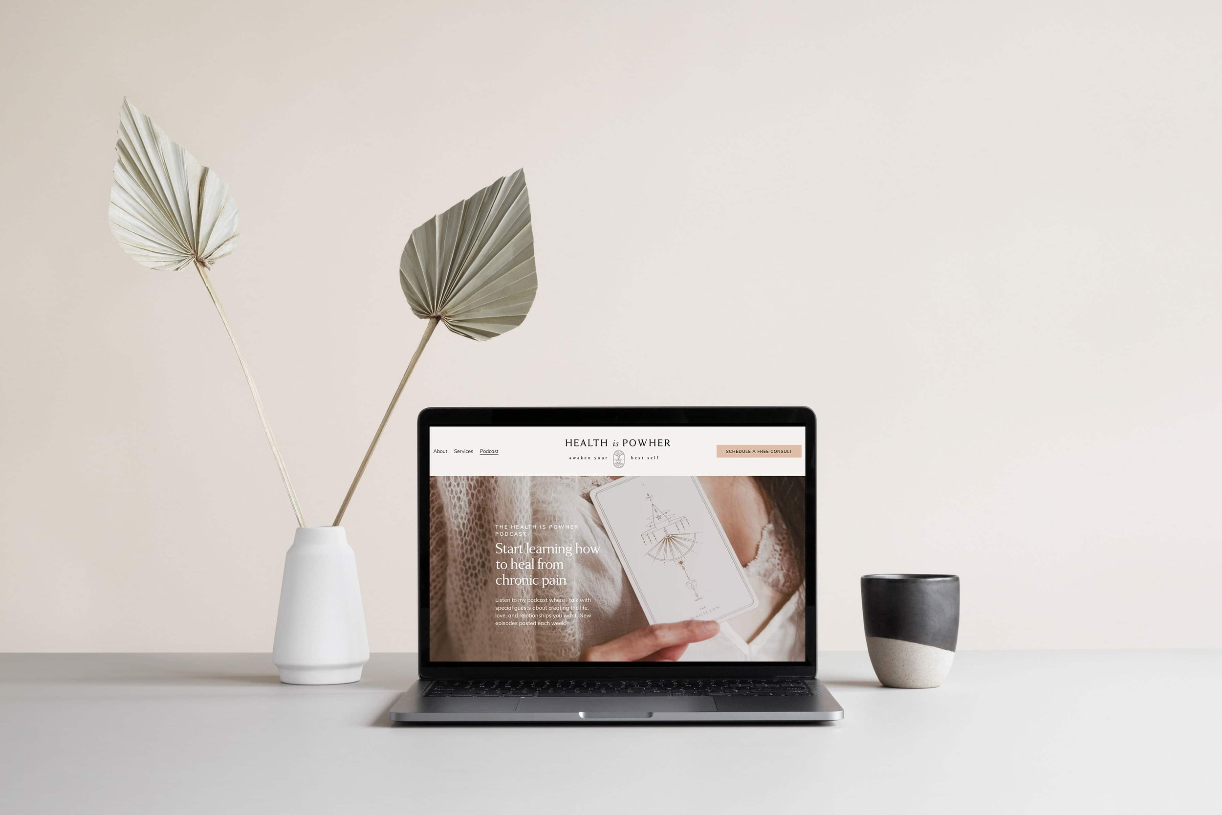
Here’s a look at some of the new Squarespace page designs I recently did for my clients:
Here’s a detailed breakdown of the changes:
Because there are so many systemic changes from the old to the new version in order to switch over to 7.1 you need to build the site from scratch and then move your domain over. While this sounds daunting, I LOVE helping my clients with this! More on that later.
No more coding
In the old Squarespace version, in order to get certain looks you had to mine for the code you wanted and input all sorts of work arounds. Not with the new version! Now, I hardly use code for the sites I design which gives my clients a lot more autonomy and empowerment when making changes or updates.
Small but efficient changes
A small change I love in the new version is duplicating objects, resizing images and easily adding in shapes. While these sound like small changes, they really make a big difference when you’re designing a site. Instead of a section taking an hour, it can take 15 minutes.
Better user experience on mobile
Another really important feature is mobile-isolated design. We are on our phones more than ever these days and it’s incredibly important that you have a great user experience on mobile. With the Fluid Engine upgrade you can now isolate your mobile design - which takes longer, but REALLY helps the user experience.
Simple backend
The backend is also improved. In the old version of Squarespace, in the Pages tab you had a mile-long collection of sections and pages, but in the new version, the pages are condensed in the backend, which makes finding pages a breeze.
Better SEO
Another big upgrade was that Google now favors new Squarespace sites (which was a Google upgrade in July of 2021). Due to the speed and clean coded backend. So if you’re looking to improve your SEO, this is a big reason to upgrade!
The improved interface is designed to give designers and users more creative control over the content while still providing all the tools necessary for building professional websites. This means the sky is the limit when it comes to creating a website that truly encompasses your brand and showcases your expertise and personal flair. It has been optimized for both mobile and desktop devices, allowing you access to your site from anywhere with ease. Plus, with its simple dashboard navigation and advanced features like SEO optimization, it's no wonder why so many people are turning towards Squarespace for their website needs.
But that's not all! Squarespace also offers plenty of support options including tutorials, webinars, email support, live chat with expert advisors, round-the-clock customer service via phone or email technical support as well as access to their online knowledge base where you can find answers to any questions you may have about the platform.
When it comes to customizing your website's look and feel there’s no better choice than Squarespace’s new version. With its intuitive design tools and robust feature set, you can create and edit a beautiful website in no time at all – regardless of skill level or experience! So don't miss out on these incredible changes – let me help you upgrade today and see what Squarespace 7.1 can do for you!
I help my clients with transitioning their sites over from Squarespace 7.0 to Squarespace 7.1 (Fluid Engine) all the time and I would love to help you with this too. Whether you’re looking to do a Website Refresh that uses a Squarespace template and I move your site over that way, or it’s a custom site design with my Website Virtuoso experience, there are options for you. Simply schedule a call to talk over the options and we can find the perfect solution for you!


