Barb’s Rebranding Journey
Why share my branding process so openly on the podcast?
Ever since I started my podcast back in September of 2023, I wanted to have a mini series documenting my client’s rebranding journey from start to finish; a true behind-the-scenes peek of each one of our calls and sharing what goes into making branding decisions from the client and designer perspective.
Well that dream has finally come to fruition! In episodes 24–27 of the Rebrand with RuthAnn podcast, my amazing client Barb shares openly and honestly through the whole branding process - all of which I have compiled here for ease of accessibility, along with al the visuals that pertained to each week of our project.
You’ll find out what happened in each call via the notes or you can listen to it from the podcast player embedded below as well.
Creating this was such as joy, as was working with my client. I would love to introduce you to Barb Davids.
About Barb Davids
Barb is an SEO and content marketing consultant and owner of Compass Digital Strategies. Driven by data and analytics, she works hard to get business-changing results for her clients, such as 256% more website traffic and 22% more leads. In her spare time, she and her dog Stone run and travel around the US.
Follow along! Website and Instagram
Listen to Ep. 8 on Rebrand with RuthAnn where Barb Davids is featured sharing her knowledge and expertise on SEO
Barb’s goal in rebranding:
Barb told me in her discovery call that even though she loved the copy on her site, her visuals felt like they were missing something. She said her site felt like every other SEO person’s and she was ready to bring more personality into her visual brand.
After being in business for 5 years, Barb felt like her visual brand was “messy” and it didn’t look credible. So we were on a mission to change that.
She used to only have 1:1 support and now she has a group program, she launched a podcast, and was ready to start expanding and growing her business. With the expansion and desire to scale Barb was ready to have a brand that was laid out and easy to follow, one she could implement in her marketing materials and it all be on brand. RATHER than, spending tons of time in Canva and reinventing the wheel every time.
So, the plan was:
• Make Barb’s visual brand unique and captivating so she could stand out in the SEO industry
• Integrate Barb’s personality more into her visual brand
• Give her a roadmap for how to use her branding in her marketing materials
Totally doable and I was excited to get started!
WEEK 1
The Brand Strategy Kick-Off Call and Project Introduction
In this first episode, we recorded the Kick-Off call which is a deep dive into brand strategy for Barb, the goals for her rebrand, her core values, target clients, and the style and vibe of the visual brand and more. We discuss the logo, brand collateral, and next steps.
First I lay some ground rules:
I welcome Barb to our call and right off the top I lay out some ground rules and boundaries when it comes to working with me during the process. I share that I offer 1 logo proof at a time so as not to overwhelm the client but also to keep our revisions as productive as possible. I also share that I have a capped number of revisions so our revision process can be focused and effective while also keeping the project streamlined and on schedule.
From there, we talk through the Brand Questionnaire
We go through Barb’s completed Questionnaire which she submitted ahead of time, and we go through the 5 sections of the Questionnaire including
Identifying Core Values - Identifying a business’s core values are EXTREMELY important. Not only is it your North Star for making decisions in your business but your core values come up more often then you think and identifying them and making them clear and concrete helps you make better decisions in your business from how you like to work to boundaries around clients.
For Barb, her Core Values are: Transparency, Discipline, and Resourcefulness. This comes across in how she works with her clients. She’s incredibly transparent with how her clients can get found on Google using plain language rather than jargon. Barb is disciplined in her personal and professional life and that comes across in her free and paid content quality. And with resourcefulness she always finds a solution for her clients and keeps her client’s best interests at heart.Uncovering the WHY of the business - Knowing your Why keeps you motivated when the going gets tough. It also keeps you encouraged to grow, find new or better solutions, and will guide you and inspire you while in the day-to-day grind.
In Barb’s own words she says, “My business exists to help other business owners grow their business. I believe I ignite energy and inspiration in other business owners. My experience and expertise in digital marketing is super helpful for other business owners who want to spend time on their craft rather than trying to figure out how to market their business. I started my business to be able to work any time, any where, while helping others and having the opportunity to visit different cities, spread my knowledge with other business owners and spend time with family. My business allows me that WHILE helping others.”
We also discuss what makes Barb’s SEO business different than her competitors, what makes her stand out, her mission statement, goals for her business, and what things she wanted to highlight and emphasize the most. For Barb it’s all about clear direction without confusion. No jargin here. Only helpful, straightforward content and solutions so more small business owners can get found on Google.Naming Your Target Audience - A key ingredient to really effective visual branding is knowing who your ideal client is and speaking right to them. This creates connection and the ability to attract the exact right-fit clients to work with you.
For Barb, her ideal clients a serviced based small businesses, in business at least 3 years, female, ambitious, kids or no kids, they love love love their business and what they do.
Identifying the Style and Vibe of the Visual Brand - This is the most fun section in my mind because we go over the tone she wants to convey, HOW she wants her audience to feel when they interact with her visual brand, what she loves in a logo, what she wants to incorporate and also what she wants to stay away from
Choosing How They Would Like to Work With Me and Submitting Their Pinterest Board - And finally in the Brand Questionnaire and in our call together the client is able to share with me how they want to participate in the visual branding on a scale of 1-4 1 being hardly involved, to 4 wanting to be in on every detail. This helps me know how best to communicate and explain design decisions. Barb chose 3, to be very involved but trusts me in the process.
Barb shared her Pinterest Board with me that we went over together.
We wrapped up our call with choosing her two Marketing Collateral pieces.
Marketing Collateral is any front-facing form of marketing to attract ideal clients. This could be business cards, print materials, social media graphics, an opt-in design, or whatever else could be most beneficial for your business.
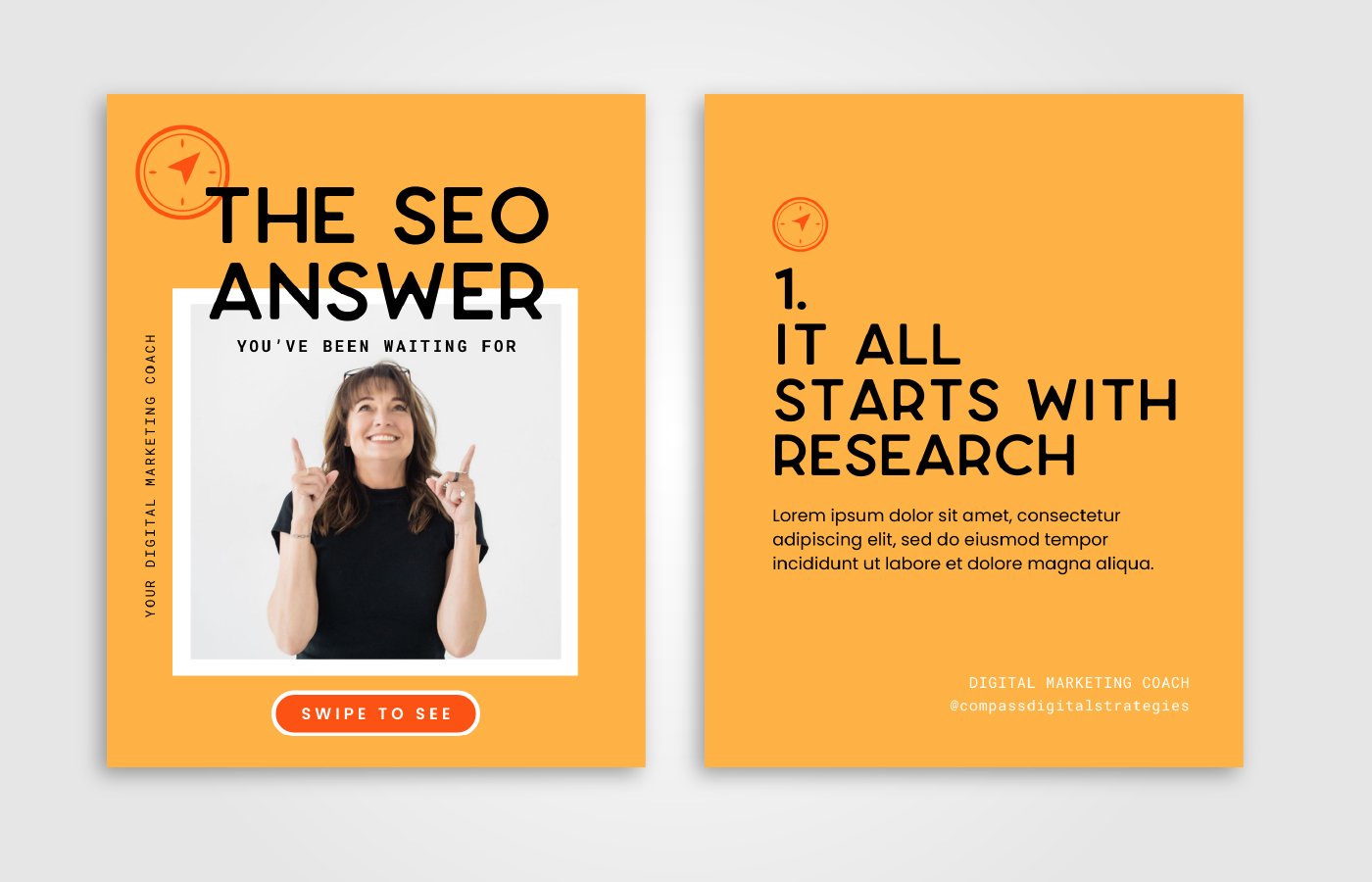
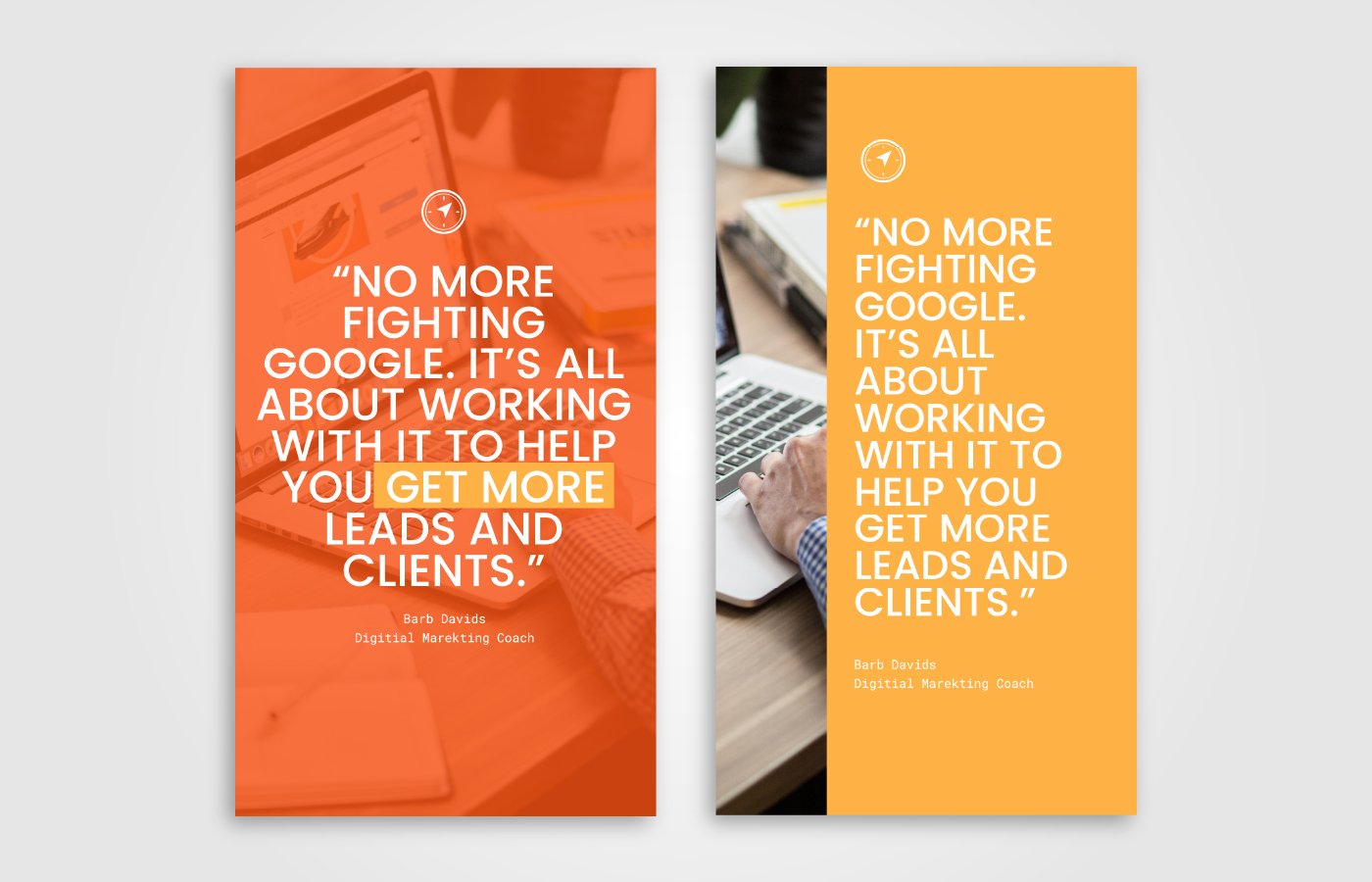
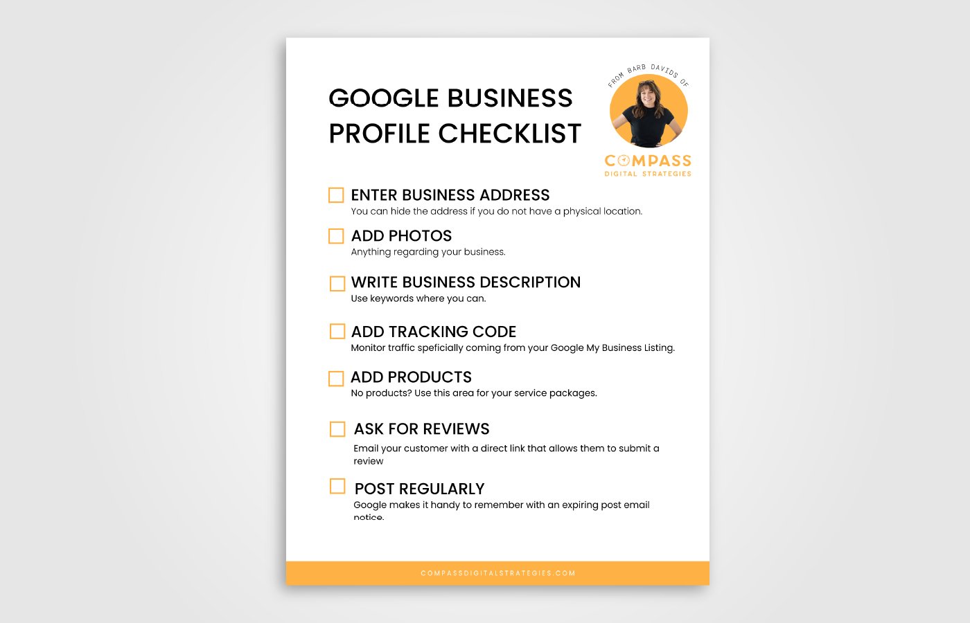
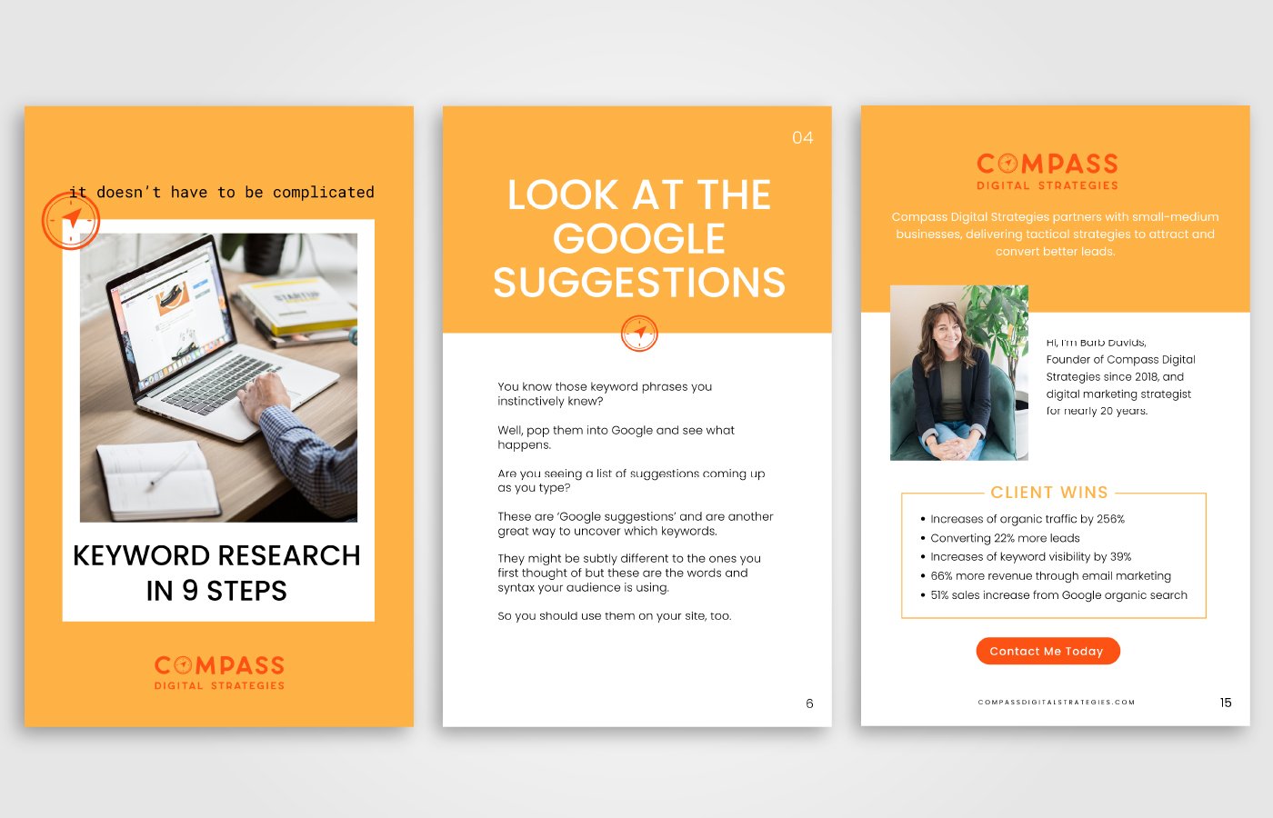
Barb chose Instagram graphics - story and post. And also the covers of 2 opt-ins and one inside page and back page of one opt-in.
We concluded with me saying I would send her the first proof of the Inspiration Board and Color Palette by Friday (We recorded on a Wednesday).
WEEK 2
Reviewing the Inspiration Board and Color Palette
From this week on the calls get shorter and shorter because a lot of the work is conducted when I send the proofs and Barb replies in the form I send over. But we do our best to share her thoughts each step of the way.
In this week of the project, we’re discussing the Inspiration Board and Color Palette presentation. In the first part of the episode it’s a Loom video of what I sent to Barb explaining my design decisions for why I chose different elements for the Inspiration Board and Color Palette. And the second half of the episode we’re discussing Barb’s initial thoughts, reactions, revisions, and next steps.
Barb’s initial thoughts and reactions to the presentation:
She LOVED the Inspiration Board and felt like it conveyed the feelings she wanted her ideal clients to feel: security, fun, comfortability, friendliness, calm, and excitement.
FIRST PROOF for INSPIRATION BOARD
FIRST PROOFS for COLOR PALETTES
COLOR PALETTE A
COLOR PALETTE B
Color Palette feedback
While Barb loved both color palettes in different ways, she felt like Concept A was more on point with her vibe and personality. The only thing she didn’t love in that color palette was the Terracotta color, it was similar to the orange and not enough contrast so I said I would present her with a Color Palette Revision (see Loom video below).
I decided to add in a mid tone blue color. Because we had a dark blue and a light blue, and I thought the mid tone would round out the palette well and give some more options for a blue.
COLOR PALETTE REVISION
WEEK 3
Logo Suite Roadblocks
What happens when your designer sends you a logo you’re not in love with? How do you keep feedback constructive to move forward? Well, you’re going to hear all of it as we are in week 3 of Barb’s branding journey. This week I present the logo suite concept to Barb and we discuss finalizing it and what it needs to get to the finish line. We also discuss how we finished the color palette and what’s next after the logo suite and looking beyond to the marketing collateral.
LOGO SKETCHING
LOGO PROOF 1
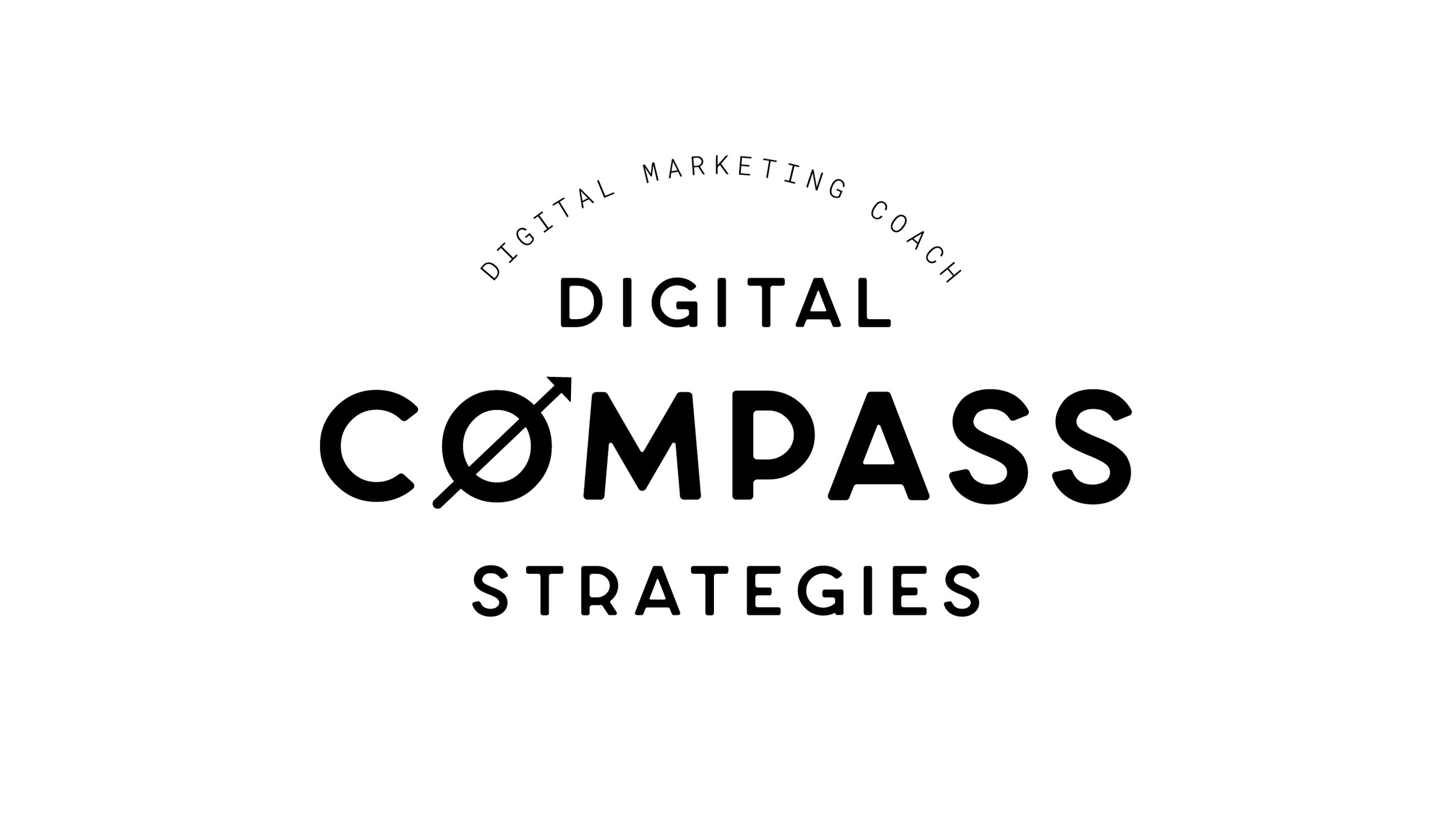
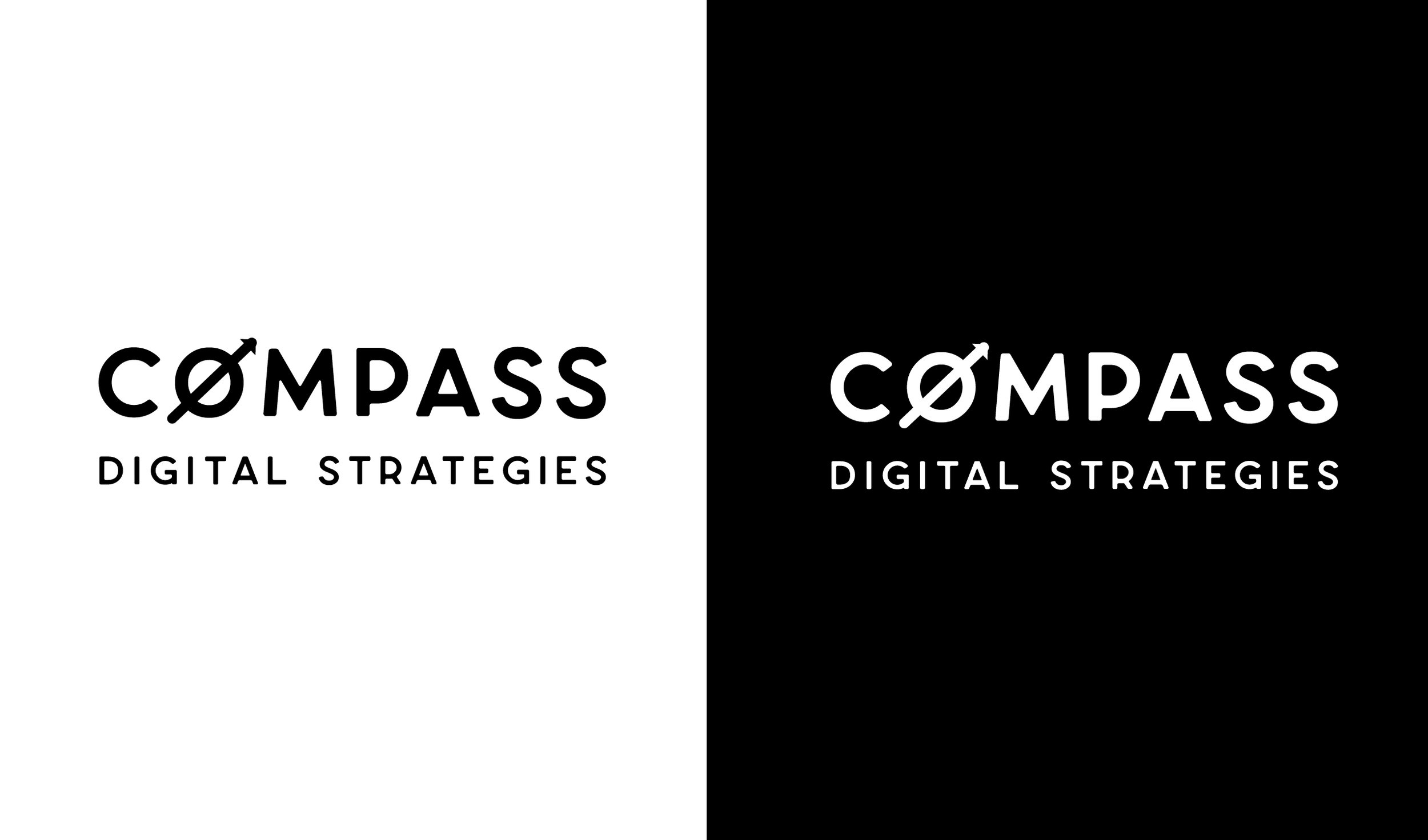

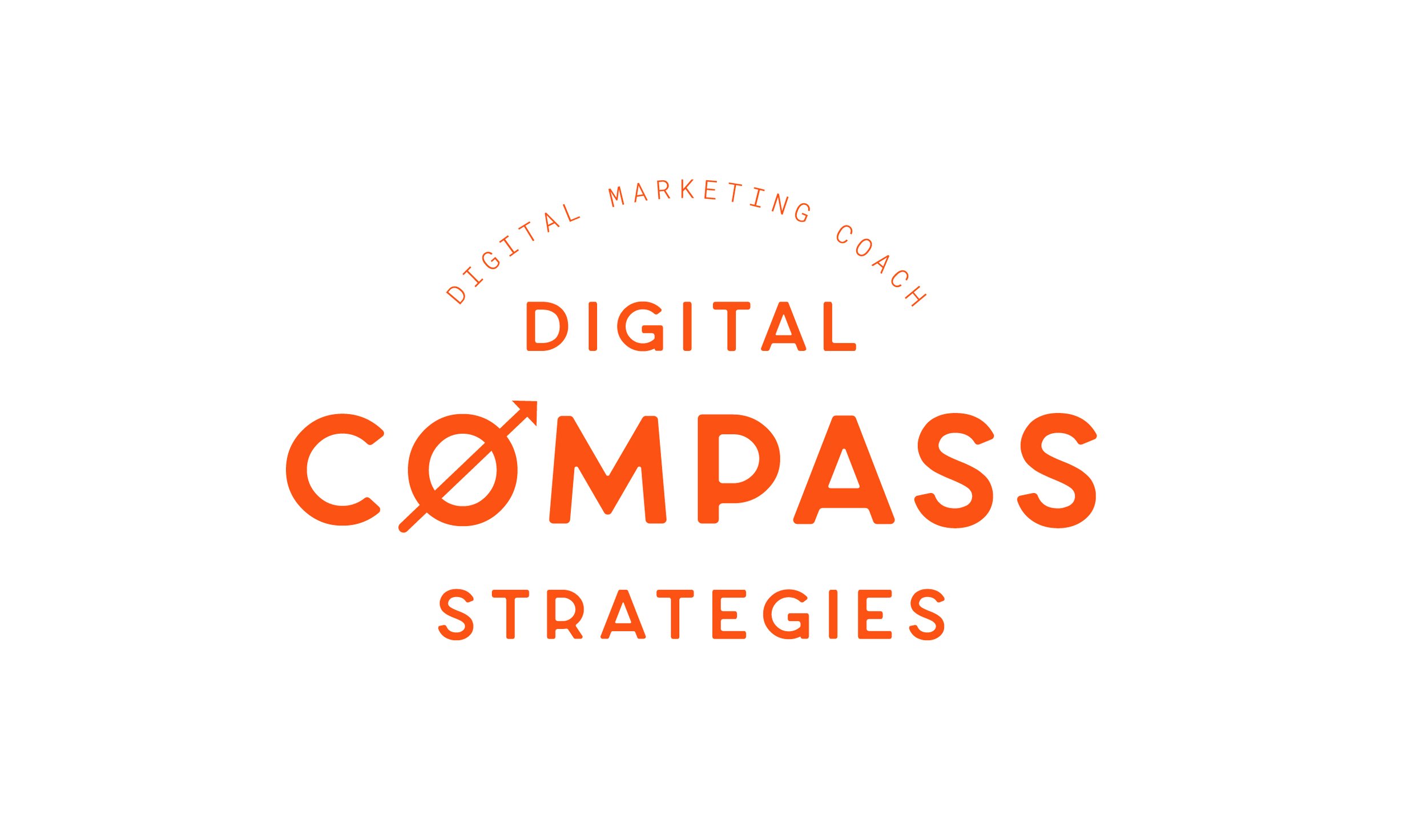
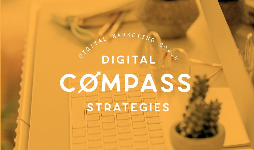
I typically provide only one Logo Suite Concept and this is for multiple reasons, the main ones being so overwhelm doesn't set it and feedback is focused. I’ve noticed in the past when I present multiple concepts, the feedback is unclear or they want to see more ideas or they like parts of one and parts of another and it can get a little confusing.
Rather, I have found that when I present one Logo Suite Concept, it helps us have a good starting point. The client can easily pick out things they like/don’t like and it’s easier to have productive feedback and clear direction.
Barb’s feedback of the logo
Barb told me she loved the font selection for the logo and the style and design but the only thing was the “o” in compass - which was more abstract - it was TOO abstract and she wanted to see something that looked more like a compass. With some detail but not too much.
She emailed me after our call and send over some compass ideas and told me what she liked about each design and didn’t like about others, which was SUPER helpful.
Barb also approved the Color Palette Revision.
I told her I would send over a Logo Suite Revision in a couple days.
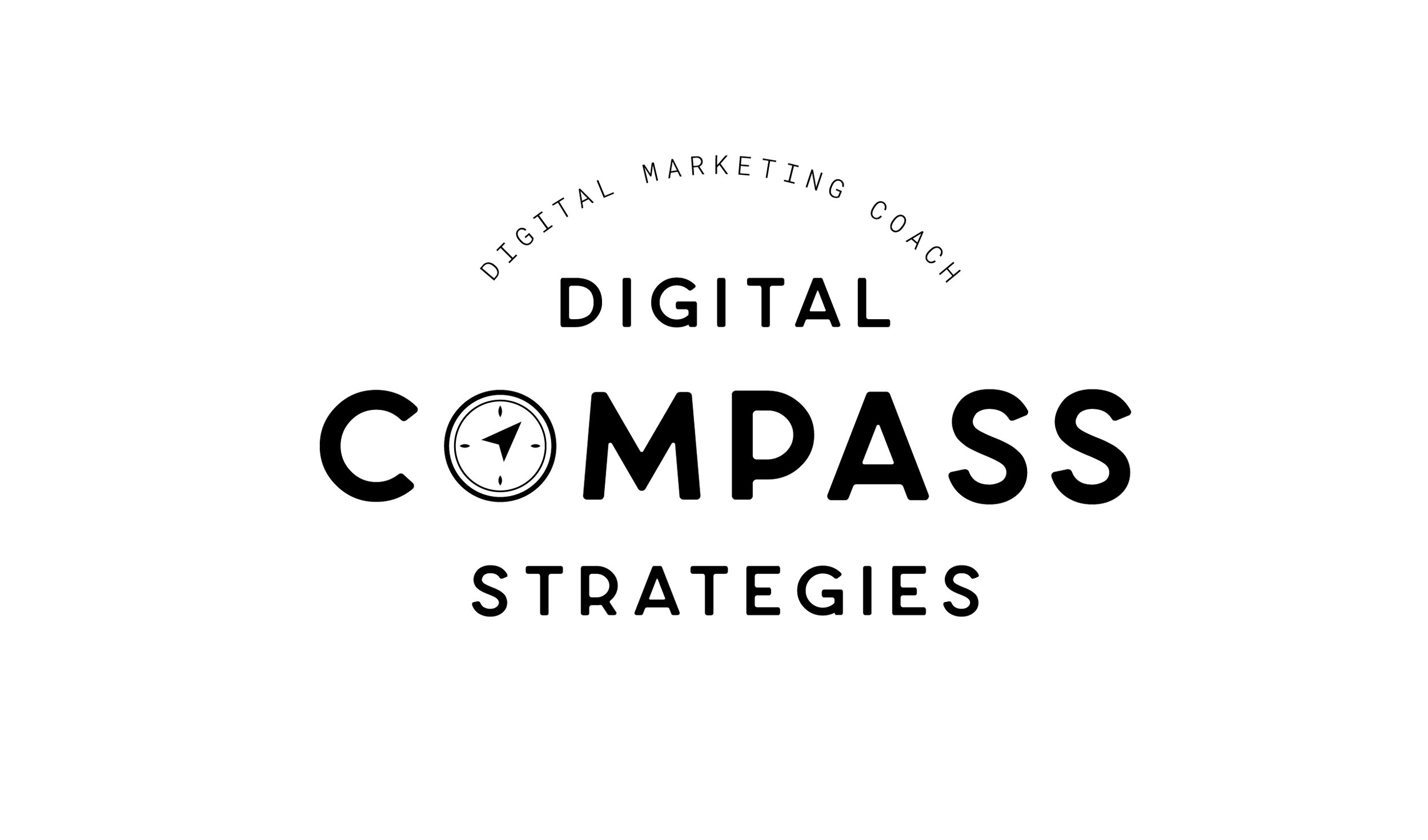
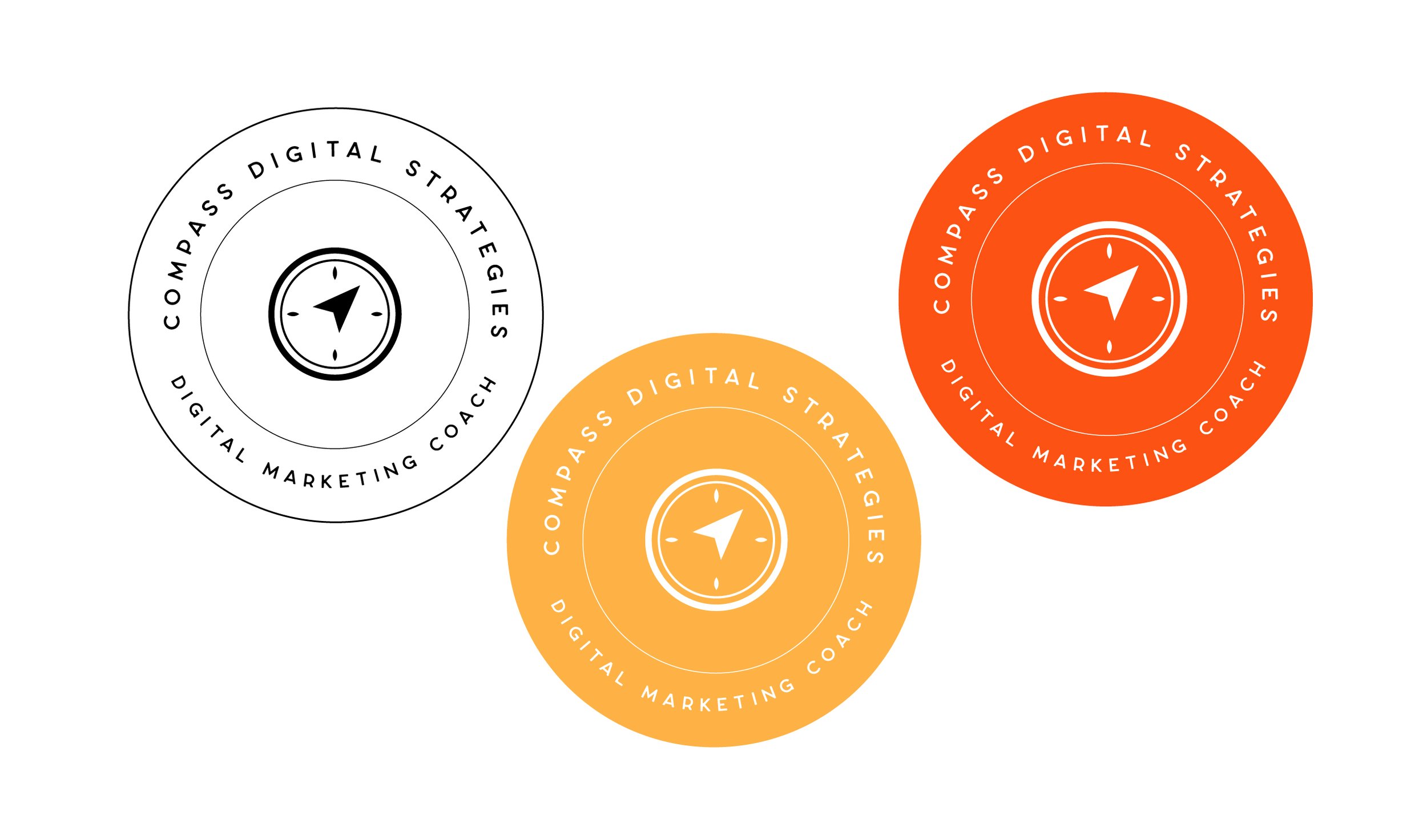
LOGO SUITE REVISION


In between calls:
• Barb approved the Logo Suite Revision - she LOVED the new compass design and all the logo variations!
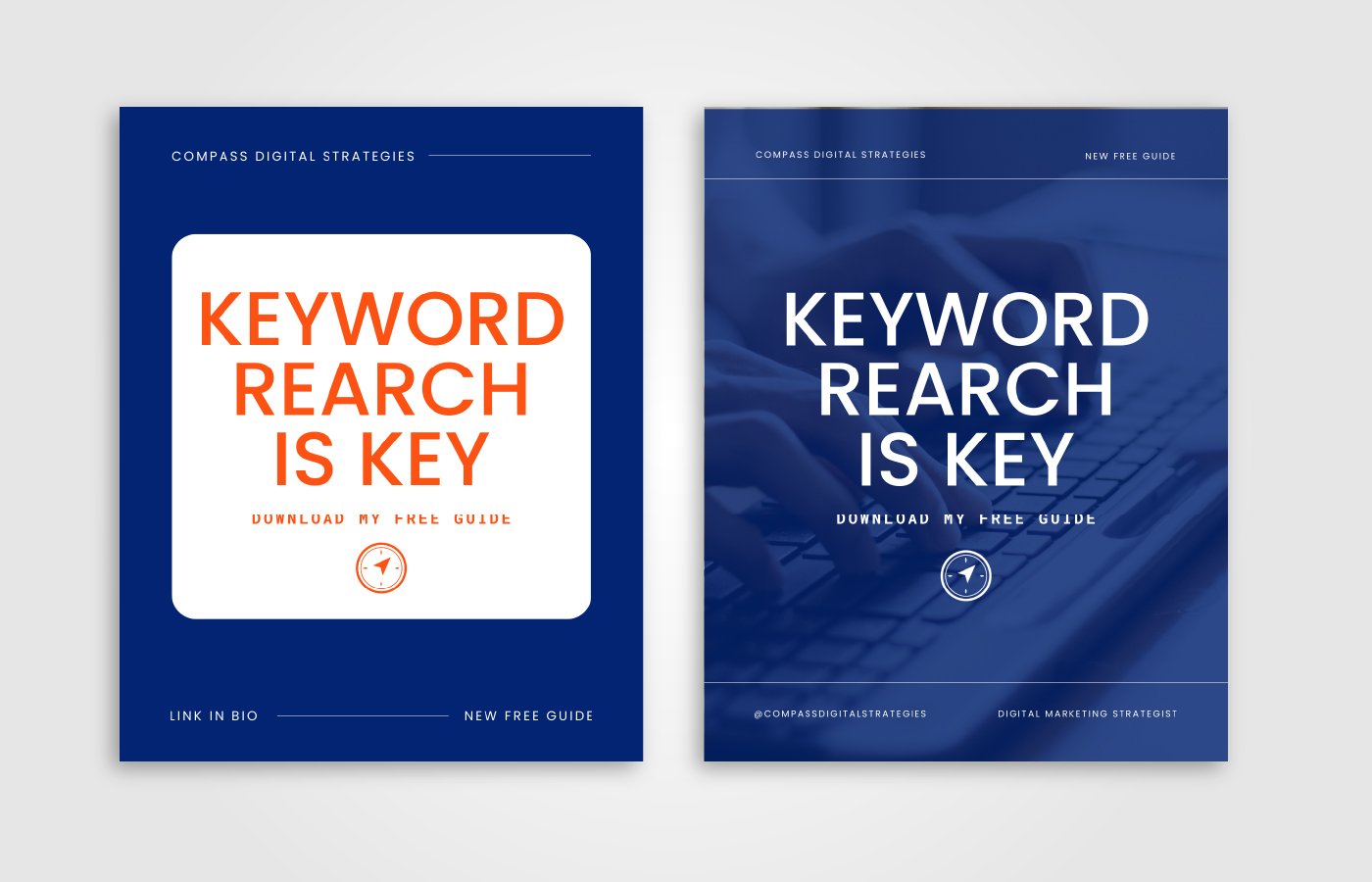
• I also sent over the Marketing Collateral Items for her to review. And Barb asked for Instagram Story and Grid graphics as well as her Opt-in Design cover, middle page, and last page. All of these were done in Canva, so any changes she wanted to see I easily made them in Canva so she could see the changes and access all the graphics.
WEEK 4
How to Use Your Brand Files and Marketing Collateral
We wrapped up Barb’s rebranding journey in our 4th call of the series. In this episode (and in this call) we talked about the revisions to the Marketing Collateral and I also presented all her final brand files and shared how best to use them.
In the first part of the episode we review the Marketing Collateral I sent over which was Instagram graphics and Barb’s opt-in design. In the second part of the episode I walk Barb through all her brand files and how to use her Brand Style guide, files, etc.
I ALSO PRESENTED BARB WITH LAUNCH GRAPHICS SHE COULD SHARE DURING HER LAUNCH:
Our whole branding process took 4 weeks start to finish, which is typical with most of my Artisan Branding clients. Barb had minimal revisions throughout so we were able to stay on track with the shorter timeline.
Along with all the logo files, I presented Barb with a “Quick” Brand Style Guide, so she could easily see her Hex colors, Inspiration Board, and fonts, and I also provided an “In Depth” Brand Style Guide that goes more into the specifics of her logo, how to use the files, how to use her colors like which ones are primary and accents, and how to use her fonts and so much more. This is something Barb greatly appreciated.
Because Barb’s color palette is so bright and vibrant, I recommended that Barb use her colors sparingly at a time. I told her use only 2 colors at a time so the brand could look elevated.
I also recommended Barb use more of her amazing brand photos in her marketing materials as this will help her personality shine through, build connection with her audience, and build her personal brand AND help her stand out in the SEO industry.
Q&A with Barb and Debriefing the Branding Journey
Two weeks later we recorded a debrief call which was two weeks after I gave her all the branding files, we had a chance to sit down and discuss how implementing the brand has been going, such as in her website and Canva. Barb shares openly with things that she found helpful and things that she had to work through. We discuss the feeling of credibility and authority that comes with a new brand. The episode concludes with answering 3 questions on the rebranding process, including duration of a rebrand, the nervousness in sharing the rebrand journey, and the decision to hire out for branding. And Barb shares her thoughts on when you should outsource this.
We discussed:
Implementing branding into a website and Canva can be done in a few hours or a day, depending on the complexity of the project.
Creating a checklist and prioritizing tasks can help streamline the implementation process.
Using theme customization and CSS can make it easier to update colors, fonts, and navigation across a website.
Templates in Canva can save time and provide a consistent look and feel for graphics.
A new brand can give a business more credibility and authority.
The duration of a rebranding process can vary depending on the scope of the project.
Sharing the rebrand journey openly can provide valuable insights for others considering a rebrand.
Hiring a professional for branding can save time and ensure a custom and professional look for a business.
Official Testimonial
“Before I didn't feel like my website felt inviting. Now I feel like my brand looks more credible and trustworthy.”
I get so many compliments on my rebranding! RuthAnn is so incredible at what she does. I've been in business almost 5 years and felt like my brand was a little messy visually. I didn't feel like my website felt inviting. I came across RuthAnn in a podcast and knew I had to work with her. The entire process was so easy. And now I feel like my brand looks more credible and trustworthy than it did before. Thanks, RuthAnn!
BARB DAVIDS
Are you ready to rebrand with RuthAnn?
Ready to reach that next financial milestone but feel like your DIY website is holding you back? No more spending countless fruitless hours in Canva and not feeling like the expert you are. I would love to help you in the rebranding process! If you are an ambitious, established woman coach or service provider, you would be an excellent fit for my services. Fill out the contact form, start the conversation and let’s reach your biggest goals - it’s all possible!
Want to feature your rebranding journey on the podcast? Inquire at ruthann(at)rartspace.com

