Brand Reveal for Katie Rollins
Katie is a successful online marketer but felt like her online presence was “chaotic.” It was too all over the place and didn’t look cohesive across platforms.
When Katie reached out to me about branding I was thrilled to work with her. She opted for the Brand + Photos + Website service which meant her branding and photos were fully custom.
Not only did end up with a brand she loves, but she now looks the part of a successful, savvy boss who is killing it in her industry, which she was all along.
As a coach and marketer, Katie understands how to talk to her ideal clients, how to form a tribe and how to sell, which stem from her ability to be completely herself, share her experiences and tell it how it is.
This confidence and charisma also brought with it an understanding of why having a cohesive brand is important– so you can easily attract your ideal tribe and stand out online. And Katie also understood the importance of growing her tribe on her own terms– meaning on a website that was all her own instead of just social media.
So with this complete brand renovation to her online presence in mind, we began simple. With a Branding Deep Dive (a questionnaire I give my clients), to fully understand the heart of her business, what makes them unique and highlighting those certain aspects in their branding.
Here are a few words Katie used to describe her brand:
• Uplifting
• Friendly
• Sassy
• Fun
With these words in mind I found images (and used some of her own) to create an Inspiration Board that would guide our future branding elements. Taking a cue from her headshot brand photos I used colors that were bright, playful, fun and approachable and while the brand we developed for her is fun and sassy, it’s also professional and crisp.
After the inspiration board we moved on to the logo design, color palette and brand presentation.
Her logo is a combination of a professional, modern serif and a fun, playful, handwritten font. The combination highlights the fact that Katie is capable and smart, yet also playful and fun.
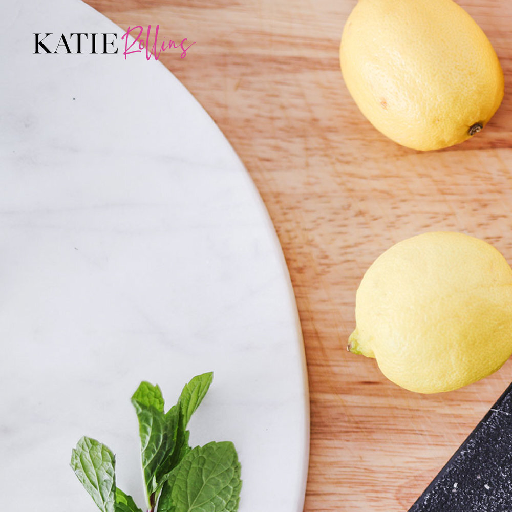
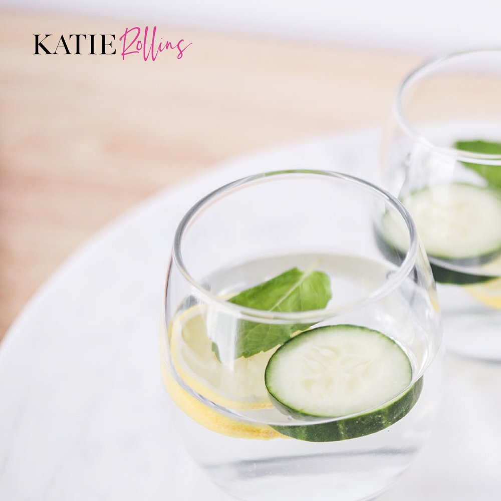
After her branding developed we went on to create the Styled Photoshoot. The photos we created were a mix of health food (because Katie encourages the Keto diet), an office shoot to capture the smart and successful vibe and the lounge shoot for a more informal look.
The Styled Photos solidified Katie’s brand and highlighted elements that are important to her business and how she helps her tribe.
Our project culminated with the website. We created a Squarespace site centered around the purpose of growing her newsletter list, thus we created 2 beautifully designed opt-ins that can help people with both starting Keto and starting healthy mindset practices.
And, bonus! In both the website and with the opt-in we were able to use the photos from our Styled Photoshoot that adds an element of cohesion, clarity and beauty across all platforms.
Working on this Brand + Photos + Website project with Katie was such a joy and now Katie has a brand foundation that she can build her business on for years to come!
I would love to hear what you think of the brand!
Let me know in the comments.

